Pages

Wednesday, 27 April 2016

TREND // POM POMS

Three words I never thought I'd hear uttered in the same sentence - "pom poms" and "fashion".  Pom poms evoke for me imagery of high school cheerleaders, and really dodgy children's clothing that that poor someone in your year at primary / nursery school was made to wear by their parents. Never in my wildest dreams, did I think it would take off and go from novelty to serious fashion trend. But it has. And I'm not talking about pom pom bobble hats, pom poms on Christmas socks, or those pom pom key rings that are increasingly cropping up on bags. I'm talking full on pom poms. On jumpers, shoes, everywhere. At the end of last year, Topshop reported an 100% increase of sales of hats with pom poms on them. Those of you frequent to the ASOS website (guilty as charged!), will notice that ASOS are stocking more and more shoes with pom poms on them. And the likes of Sophie Hulme have sent pom pom with googly eyes down the catwalk.

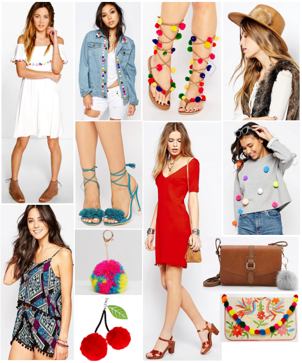
For some pom poms may be a difficult pill to swallow - but they needn't be. This trend is meant to be fun, tongue in cheek, and one where fashion doesn't take itself too seriously. And quite rightly so too. There are a variety of different pom pom options out there. If you don't feel you can pull off the larger pom pom, there are miniature, more discreet versions out there. And the same applies to colour. You can either rock the multi coloured pom pom, or just stick to one colour. There is plenty of flexibility, and it's a trend that is wearable for everyone, no matter if your style is more polished than grunge. Or vice versa. Here's a little taster of all my favourite pom poms out there right now:


Or failing that why not try some pom pom DIY? Hobbycraft sell lots of different colours here so you can stitch onto your clothing and accessories as you please! I especially love their blue pom poms and tie dye rainbow coloured ones.

Having already ordered the white off the shoulder dress (above), next on my wish list is a a pair of lace up shoes which travel up the leg with some pom poms for added sass.

How do you feel about the pom pom trend?

Saturday, 16 April 2016

A Columbian feast at La Bodeguita

Knowing where to eat in London is hard. There are so many different types of cuisine, the struggle is real. Enter Sara. Sara I've known for over 10 years now and these 10 years have been a culinary adventure. I've learnt so much about what London has to offer, and tried cuisines I never would have tried, all thanks to her. The other night she suggested going for Columbian food which I'd never had before and really wanted to see what it was all about. Say hello to La Bodeguita. Located in Elephant and Castle (within the Southwark borough of London), La Bodeguita offers a wide range of tasty sounding Latin American dishes. We opted out of starters as judging by the tables around us, portion sizes looked pretty generous! So I'll proceed swiftly onto the main course if I may?

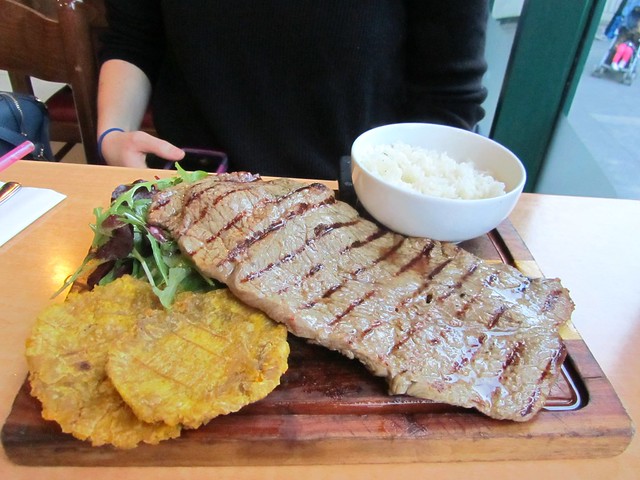
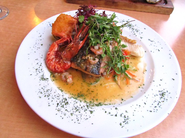
And then came the big question: Meat or fish? Initially I had my eye on the Bandeja Paisa - a one pot dish of rice, pork belly, sausages, kidney beans, mince meat, plantain, avocado, corn and a fried egg. But then a seafood stew with rice and a side of plantain sounded equally delicious. In the end I went full volte-face and opted for neither - instead I chose the Duos de pescados ("fish duo") which was beautifully presented on a bed of salad and spiralized carrot. Sara went for the steak, salad, rice and plantain dish which I must say, was the biggest steak I have ever seen in my entire life!


She had asked for her steak to be medium rare (a girl after my own heart!) but as this turned out to be quite a thin piece of meat, I was concerned on her behalf that it would be crucified over-done. But Sara assured me that it was spot on and how she liked it. Her only piece of constructive criticism about the steak was that as it was such a huge amount, you did feel like you needed an extra little something with it. So she asked for some additional dips and sauces. This being no reflection on the taste of the steak at all (she said it was certainly tasty enough!), but that much steak with quite dry food types like rice and the fried plantain, you needed another texture in there.


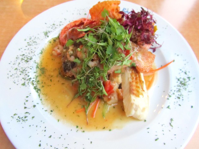
Comparatively, my dish came with a butter, lemon and white wine sauce. I'm not the biggest fan of sauces, however this was such a subtle and light flavour, it perfectly complimented the fish without being too heavy. The butter was minimal so it wasn't too oily or greasy on the plate - in fact it helped keep the fish super soft and gave it a melt in the mouth quality.


The two fishes in question were salmon filet and tilapia - but it did come with shrimps and a langoustine too. And that orange coloured 'nugget' you may have spotted? That was salmon coated in breadcrumbs and it was wonderful (think posh fish finger!). The salmon was the best salmon filet I've ever had in a restaurant. I find that most places over cook their salmon and as a result, the fish is bone dry. However La Bodeguita's salmon was really moist, and done just how I like it. When I tucked further into my dish, I came across two little 'baskets' (not pictured) which were fried plantain that had been shaped and filled with shrimps, coriander and a tomato salsa. There were the prettiest, most imaginatively presented things I've seen on a plate in a long time, and I'm still kicking myself that I didn't see them sooner and get a picture of them from the offset before I devoured them!


As you can bear witness, these were sizeable portions. Sara managed to clear her plate whereas I had to sacrifice a tiny bit of the salmon, which was a crime when it tasted that good. We were both too full for dessert, so we sat chatting whilst finishing up the last of our drinks (her a cocktail, me a glass of red wine).

SUMMARY

If you like flavoursome food, generous portion sizes and plantain, then you'll like La Bodeguita! This is no exaggeration, but plantain was actually an accompaniment for most dishes on the menu! The atmosphere was pleasant - it wasn't too loud in there so we could hear each other speak (always a bonus!), but it wasn't deadly silent either. Which works for me, as I don't like places to be ghost towns - filled seats are always a sign of a good place! The staff there were very attentive, welcoming and friendly. Rather than the obligatory one "how is your meal?", they stopped by our table several times to make sure everything was ok. And we were not hassled once to spend more / hurry up eating / get out of there quickly. It was a lovely, relaxed meal where we didn't feel pressurised or rushed - a sign of a good restaurant. I was also really impressed with the price of my wine. Often in Central London I have to pay £5.90 - £7 for a glass of wine, whereas at La Bodeguita my wine was £2.95 if I remember correctly? And it wasn't a stingy amount, or a cheap, unknown brand either. It was a Hardy's Merlot and it was one of the most enjoyable glasses of red I've had in a restaurant for a long, long time.

So if you're ever looking for food in Central London, don't ignore Elephant & Castle. Not traditionally reputed for its food, don't let that put you off as there are some right gems in the area. And as a fully paying customer, I can definitely vouch for La Bodeguita. If like me you are curious about Columbian food, you can find their menu here.

Wednesday, 13 April 2016

Shabby chic interior design and the dreamiest of house and home images

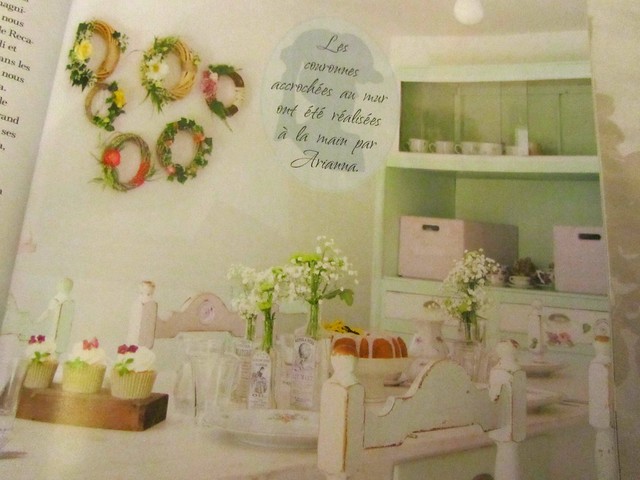
House and home magazines have become a little bit of an obsession of mine to say the least. Last summer I found the mother of all house magazines in France. It was a guide to decorating in a "shabby chic" style and contained the sort of aesthetic I pin frequently to my house and home board on Pinterest. It was that typical blogger / Instagram house with white everything and cute, whimsical little touches. I was coming to the end of my holiday and as tempted as I was to pick up the magazine, my supermarket trolley (and not to mention suitcase!) were already plenty full with biscuits, cakes and treats galore for family and work. I literally couldn't carry much else... so I had to forgo the magazine.

Then fast forward a few months to when my folks came back from holiday (also France!). As well as a very colourful box of macarons, they'd also brought me back a selection of magazines. In amongst them were some house titles and.... you've guessed it... the shabby chic magazine! Turns out it isn't a regular publication and only comes out 2-3 times a year. So it was in fact the very same copy I'd seen on my travels! I hadn't mentioned it to them at all at the time - it was just an amazing coincidence! So without further ado, let me introduce you to Shabby Style magazine...


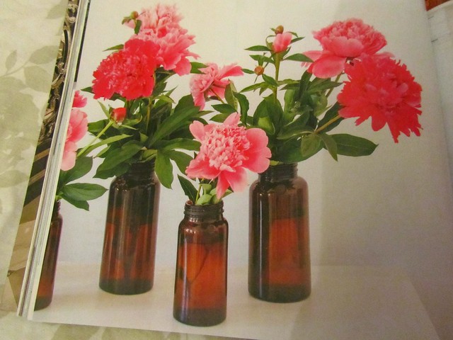
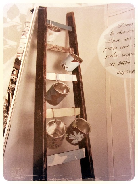
If I had to describe the aesthetic in this magazine in a few words, it'd be 'homely', 'family friendly' and 'welcoming'. You can actually imagine people living in the rooms they feature - rather than perfectly pristine houses with a you-better-not-spill-your-red-wine-on-my-brand-number-designer-rug mindset. The focus instead being on classic pieces of furniture lovingly up-cycled, as well as newer pieces of furniture intentionally bought for that more rustic(?) look. Think furniture with chipped paint, scuffs, old jars, bottles and food containers on display, ladders used as shelving, freshly picked flowers in jam jars and bottles. In summary, really chic looking, and at the same time, really French looking. I love it.


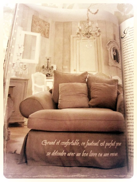
And the living room / snug / den / drawing room / lounge of my dreams:


I love the neutral colour palette with the mocha coloured sofa and the ornate details of the mirrors and chandeliers. A room like this has such a regal and calming quality to it. And the brown gives it some warmth so the colour scheme isn't too 'cold'.

Are you into the 'shabby chic' aesthetic?

Thursday, 7 April 2016

7 ways to make your blog / vlog more relatable, so more people subscribe and stay


"Lucy, what pray tell is "relatable content?" I hear you ask. In this sense, "relatable" meaning something that is familiar to your wider audience, so much so, that they identify with your content, maximising levels of engagement. Being relatable is forever important as that's how, why and when people are more likely to return to your blog / Youtube channel / social media accounts. As a mini disclaimer, in no way am I targeting any specific individuals with the below, nor am I bitter / jealous of the people that create this sort of content. It's just that recently I've seen more and more blogs and Youtube channels emulate one aesthetic, with the same blog layout, the same blog design and the same video format. I don't think it's too much to ask, but I want to be seeing content which I can actually identify with. I've been unfollowing more and more blogs and Youtube channels lately which I feel I can no longer relate to. So below are my tips for a more welcoming, relatable blog or vlog -  the types that people are more likely to subscribe to and stick around for.

Stop with the glossy magazine-like content


If I wanted to read magazine type content, I would... pick up a magazine. Same applies to vlogs and videos. If I wanted to watch something of film quality, I would hit up Netflix or Amazon Prime. More often than not, blogs are increasingly adhering to the same layout, the same aesthetic, the same massive pictures which fill your screen. Don't buy that blog template that everyone and their cat has. I know it's tempting to buy blog templates if you're not technically minded, but as so many templates are crazy expensive (I was once quoted £1000+ for one and I was like was Hell No), people turn to the handful of affordable blog template options out there. And voilĂ , the reason why so many blogs look identical these days. For me personally, the best blog designs are simple and succinct. Blog name as a header, black and white colour scheme, all your content in the middle, and a side bar with all your extras. What more do you need? It's not rocket science, and your design / layout can be easily adapted yourself without having to pay out the nose for someone else to do it for you. Why not teach yourself some simple HTML and CSS? Google search these and you'll find plenty of fantastic tutorials on these. I've unfollowed most of the 'glossier' blogs and Youtube channels lately, because I'm looking for candid videos and pictures, and more natural, simple designs that are less 'fussy'.

Be you. Warts and all

Be realistic. These days we are so used to seeing people present a polished version of themselves. Perfect hair, perfect make-up, model-like poses, photo shoot style photography, and very business like text about what they're wearing today. They have an immaculate home, and stock photos of flat lays for every occasion. Don't be afraid to share your flaws - this is what makes you human. And news flash.... being human makes you relatable. Don't vlog from under your duvet with a full face of make-up on, saying you're about to go asleep (you're clearly not!) And don't feel the need to always have perfect hair, and be dressed up to the nines. Vlog in your pyjamas before you've chosen your outfit for the day. Vlog with wet hair. Remind us how much like us you really are. If you like niche things - like you still love Pokemon - share it. Like how I'm pushing 30 and still adore Kinder Eggs. These quirks makes you unique and interesting.

Don't rely on pictures alone

Don't be one of these blogs that posts 1,456,879 pictures of the same outfit and your face from different - but not all that different - angles with virtually zero text. I don't need to see something from that many angles. If I like what you're wearing, a few pictures will suffice. Plus scrolling past all those massive pictures is hard work. Make life easier for your readers by not going too picture heavy. Instead of all those extra pictures, why not write more? I think I'm in the minority here these days, but I actually follow blogs based on their writing rather than their visual content. I always find it so much easier to relate to someone and warm to someone through their words.

Choose products and brands wisely

If you go from raving about the new season Primark and then later down the line only rave about designer make-up, designer skincare and designer bags... it's too big of a leap and you risk alienating your audience. Whilst it's perfectly ok to dabble in high end goods every so often, if your blog or Youtube channel becomes inundated with these over and over again, people will switch off. I've seen influencers justify these high end buys as an "investment" to help better their blog or Instagram grid. Sorry, but I don't agree. You having designer clothing and including it in your OOTDs doesn't better your look. Someone with true style can carry off a look without having resort to designer everything. Most of your audience won't have access to the funds you do, nor will they receive beauty press samples through the post like you do. They have to spend a hell of a long time saving to afford that dream bag which is passed off as a nothing purchase on YouTube in someone's "look at all my designer bags collection haul". Don't promote unhealthy spending habits to those who can't keep up with the payments. Remember, you are massive influencers - influence for good, not bad.

Forget the fancy equipment

Vlogger protocol states that you need this DSLR, this vlogging camera, a lighting system rigged up in your house, final cut pro, and a macbook to be the top of your game. Which is definitely not the case. I've read plenty of great blogs where the pictures have come from their phone and the quality is every bit as good - proof that you don't necessarily need an expensive camera. More candid photos taken in the moment are a lot more relatable - rather than the heavily posed and pre-meditated ones trying to be all photo shoot which are cropping up more and more on blogs and Instagram. I appreciate that the evenings can be pretty dark, but you don't need pristine lighting. You are not a professional photographer or TV producer. Nor are you a model. When people have lighting rigged up for their videos or blog posts, I automatically assume that that blog is no longer directed to people like me, it's more directed to brands and companies for future potential sponsorship: 'look at me, I have pristine skin. Work with me.' Also there is plenty of good alternative video editing software out there - most free from the Internet - and I will write a separate post on these another time. Macs are more aesthetically pleasing for those "where I work" shots I realise, but macs are not the be all and end all. I wanted one for home use for ages, but I discovered they weren't all that. I use a Dell laptop to work from and I have a widescreen Toshiba laptop better suited for watching movies and TV shows on. Both of which are really good performers, and so much cheaper than a mac. Both of my machines in fact add up to less than that of a single macbook. So in summary, spending lots on fancy equipment doesn't necessarily guarantee better content or better success as a blogger / Youtuber. It's ok to be different. Be you.

Find a balance between luxury and non luxury

Recently I've been seeing more and more blogs and Youtube channels covering luxury holidays that only the small percentile of the population can afford. Particularly when priced at a £500+ a night. Whether it's holiday and travel, or anything else luxe, always strive to find a balance between luxury goods and services, and then ones that the majority of your readership / listeners can afford and actually experience. If you've one of the lucky few who have recently been whisked away on an all expenses paid trip to some tropical island somewhere, don't overload your Instagram with smug holiday pics. By all means post pictures, but don't go crazy - a few will suffice. Go overboard with the pics and you risk alienating your audience. Balance anything luxe and particularly expensive, with content that is less 'flashy'. For example if you've recently been on a luxury holiday, why not go away for a few days to the countryside? Show your audience that you are just like them (most of them being more likely to go away for day trips and weekends away in the same country rather than ramping up the air miles and heading abroad!).

Be realistic

I've seen it all. I've seen lookbooks of girls in the snow wearing heels and no coat, and I've seen girls 'pop down the road' dressed to the nines. As good as these pictures look, this just isn't realistic or relatable. This is more like the sort of photo shoot you see in a magazine and that's where they should stay - in a magazine. I've loved the normcore look of late as it's more universal and accessible. If you're popping down the road to the post office, you don't need to wear a ball gown. Jeans, flats and a sweater will suffice. My favourite lookbooks of late have been blue jeans, white Stan Smiths, knitwear and delicate jewellery. Simple but effective. Think of it as off duty model. Whilst it's nice to dress up every so often, more of your audience will relate to you if you dress in the sorts of things that you can easily buy and that are easily accessible to everyone. The fact that Primark haul videos do so well on Youtube is no coincidence. Realistic and relatable is key.

_______________________________________________________________________________________

And here concludes my seven tips on how to prevent your audience from going AWOL. Again I will reiterate, that the above is not intended to be a whinge or attack on bloggers / vloggers / any specific individuals. I am just sharing what personally makes me more likely to unsubscribe from an account - whether it be Instagram, a blog or Youtube. I don't want to see glossy, I don't want to see perfection. I want to see normalcy on my newsfeed. Because normal is relatable.
Tuesday, 5 April 2016

The clothing range that pleasantly surprised me this week

Let's talk about Marks & Spencer's clothing. M&S has always had a bit of a rap for being a bit 'mumsy'. When I was growing up, I always thought it was more targeted to the middle aged / older woman, so never really considered M&S when I needed new clothing. Then three years ago at London Fashion Weekend I saw M&S through new eyes. In no way was it 'mumsy', it was actually bang on trend. And let's not forget that celebrities like Rosie Huntington-Whiteley and Alexa Chung are lining up to launch their own collections with M&S. Alexa Chung very soon in fact (launching this month... I can't wait!) It dawned on me the other day that I hadn't been to Marks & Spencer's clothing department (or looked online) for a little while, and thought it was high time I fixed that. To my surprise, I came up with a huge wishlist of all the items I adored (I certainly didn't think I'd be be bookmarking that many items!) So today dear friends, I am sharing my top picks with you...


Khaki jacket - Very Alexa Chung, don't you think? Wear with the bluest jeans and whitest sneakers to complete the look.

Trench coat - I do love a long coat, but being tan and in this faux suede sort of material, this coat ticks two extra boxes.

Cat purse - How cute is this purse?! Forever the crazy cat lady, I definitely need one of these in my life!

Suede lattice mules - I love cut out shoes and this tan coloured slip on pair would look perfect set against deep blue jeans.

Spotty box bag - A dead ringer for the Reiss box bags - but for a fraction of the price!

Lace blouse - Another Alexa Chung style find! This looks light and airy - perfect for the warmer weather


Tan pencil skirt - The perfect rust / tan colour. I would style this with a simple white blouse tucked in for lady-like elegance.

Tan leather jacket - .... ok faux leather, but looks pretty realistic, don't you think?

Textured wool jacket - This reminds me of a jacket I once bought (from another store) which I loved but returned as I couldn't justify the price. This jacket from M&S is a cheaper alternative to the one I saw before, but looks every inch as luxe.

Printed culottes - I've never owned a pair of culottes before, but I love this print of these ones so much I may now have to!

Tan handbag - Never have I seen a Mulberry dupe as good as this. I realise it probably wasn't designed to be a Mulberry dupe, but boy, does it look realistic! Perfect for people like me who have always dreamed of owning a Mulberry bag


Lace off the shoulder dress - I love this style of dress. I found a similar one lately elsewhere but the quality was so poor in comparison (sheer, paper thin and really, really short). This M&S offering is a much better length.

Graffiti print shirt - How eye catching is the print on this shirt?? It looks so high fashion and would look great paired with a leather skirt or worn underneath a jumpsuit or play suit.

Light blue sweater - The sweater of dreams. I need this in my wardrobe tomorrow yesterday.

Foil print skirt - This A line skirt looks almost oriental, so is great for that East meets West look. I love the metallic jacquard print set against the khaki colouring of the skirt.
__________________________________________________________________________________________________

 I know this feature may seem more directed to my UK readers than my overseas readers, but nothing could be further from the truth! Marks & Spencer does ship abroad to over 30 countries and has dedicated websites for Europe, the US and so on. So if you like any of the above and aren't from the United Kingdom, it isn't necessary game over for you!

Which items from Marks & Spencer are your favourites?