Friday, 26 June 2020

9 ways to bring more light into your home

AD | This is a sponsored post but all thoughts are my own

Identify any light blocking sources

Is there anything blocking or obscuring the windows and doors in your home? Is there a large piece of furniture in the way?  Do you have too much furniture in the room? Is your furniture too dark? Is there a large tree outside? 

Once you identity the root of the problem, it can be easy to remedy.

Rearrange your furniture. Alternatively identify if there are are any pieces of furniture not being used - or not being used to their full potential - and use this as an excuse to have a clear out. Your room will instantly feel bigger and lighter. Or simply replace taller pieces with lower level items like a lower sofa or lower storage solutions like sideboards rather than floor to ceiling cupboards. Or replace darker furniture with lighter furniture. The possibilities are endless.

If there is a tree or tall shrub obscuring a window, either cut it back or move it. If it's a smaller tree or plant which you simply don't want any more, why not offer it to a friend, neighbour or family member?

And another common light blocking source... dirty windows. Run a cloth over each of your windows and inspect - the cloth will be dirtier than you think! Cleaning your windows regularly - both inside and out - will ensure that more natural light can filter through into your home and who doesn't love sparkling windows?

Image source: Logan Nolin on Unsplash

Go for lighter window fittings

Are your curtains and blinds too heavy and not working for that particular space? Consider lighter window fittings like voile curtains that flutter in the breeze, or for privacy and light in say your bathroom (or any other rooms where the neighbours can look in!) try window film. Forget traditional, boring, cloudy window film - nowadays there are lots of lovely prints and patterns out there which will allow you to add interest to your windows whilst at the same time allowing light and privacy.

Consider your colour scheme

Keeping your walls light and bright will help create a light and airy space. Avoid bright whites (which can look cold and clinical) and instead opt for off-whites, pale greys, pastels or brights like sunny yellows. Be brave. Paint isn't expensive so you can always change your mind later! 

Design a lighting scheme

Poor lighting isn't just in relation to natural light - this also extends to artificial light (think lamps and light fittings around the home). The best artificial light will enhance any natural light coming into your home rather than take away from it. Consider LED bulbs (which are 90% more energy efficient than regular bulbs) and dimmer switches or additional lighting such as sconces and table lamps, which will allow you to both soften and layer the lighting in your home.

Get clever with mirrors 

Place a large mirror on the wall opposite to or adjacent to a window to help bounce the light around the room. Same applies with glass and / or mirrored furniture which can help a smaller space feel bigger.

Go for gloss

Whether it's paint, wall tiles, floor tiles, worktops or kitchen units, glossy surfaces reflect the light (similar to the way that a mirror would). I used to hate the glossy white wall tiles in our bathroom but now I appreciate that they keep the space light and bright and make what is a small room appear much bigger. 
 
Install skylights or a sun tunnel

An instant way to brighten up an extension or a dingy hallway is to add skylights (think Velux windows) or a sun tunnel which will allow natural light to come flooding in from above.

Install bifolds or sliding doors

Another way to brighten up a new extension - or an unextended home - is by installing bifolds or sliding doors. In both cases the slim frames and large expanses of glass help draw the eye to the outside space and help frame the view. Bifold doors open up completely which can provide more of a link to the outside, however the glass panels are often narrower, meaning you get less of a picture frame effect when the doors are closed. Sliding doors on the other hand, tend to have larger panes of glass so whether open or closed, can offer a less obscured view of the outside. 

Glass is your friend

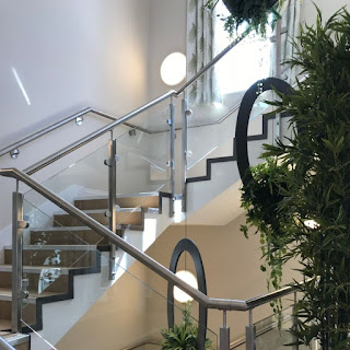
Hallways can be dingy spaces and whilst you can paint your wooden banisters and railings white, thicker banisters and railings can still be blocking precious light from filtering through the different levels of your home. One way of counteracting this is by replacing your staircase with a glass option like one of these glass balustrades from TuffX Glass so the light can pass through without any obstacles. I know from personal experience that having cats and wooden banisters is not the one (my banisters are so clawed up they could easily be mistaken for a woodworm infestation!) so the idea of having hardy metal railings or slimline glass would make our hallway look a little more polished as well as lighter and brighter!

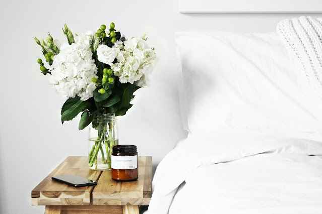
Image source: TuffX GlassImage source: TuffX Glass

Friday, 12 June 2020

11 things filling my ASOS basket lately

Broderie collar shirt (currently in the sale here) // Wine broderie dress (also in sale here) // Pink knit (also in sale here)
White dobby dress here // Khaki tie waist linen shorts here // White dobby shirt here

White broderie collar shirt

I've been toying with this shirt for the longest time but is it too extra? Turns out it's not. The balloon sleeves help balance out the wide shoulders brought on by the collar. My only slight criticism is that the body of the shirt is just way too big. Tucking the shirt in seems to help with this but I have re-ordered in a smaller size to see if a smaller size is the play here.

Another broderie collar shirt

From one broderie collar shirt to another (not pictured but you can find here) however this one is a little more low key with short sleeves and more of a normal fit. I can imagine it looking lovely peeking out from under a chunky knit.

Broderie dress

Most broderie dresses are white, long and free flowing, so I really liked this shorter version in this gorgeous wine colour with a square neckline. The dress is every bit as lovely in person and looked great on, however this enthusiasm quickly waned once I noticed a questionable crispy white stain on the front of the dress (there are no words).

White dobby shirt

I have an obsession with anything dobby and while white can be a bit of a soul less colour - particularly in interiors - this raised texture gives it an added dimension and interest. The good news? Dobby textures are starting to appear everywhere. Light boho inspired curtains and table cloths. Bedding (I have been longing over this bedding plus this). And of course clothing. I already have two white dobby shirts so why the need for a third? Because they are timeless and by far one of the most used things in my wardrobe. Perfect for a day at the office, worn casually with shorts, or as a beach cover up.

White dobby dress

Another dobby inspired find (can you tell that I'm obsessed?). It felt a little too restrictive (and conservative) when buttoned to the top. I actually preferred the dress worn back to front with the buttons behind me - is that weird?

Pink bobble knit jumper

A very similar concept in terms of that lovely raised detail to run your hands over, whilst at the same time adhering to my new found love of the colour pink as touched upon here. This sweater just looked so slouchy and comfortable and I imagined it looking amazing with one of the above broderie collar shirts worn underneath. In person it is slouchy and comfortable as well as being softer than I ever imagined. Definitely a keeper.

Tie waist shorts

I'm a big fan of khaki and high waisted trousers / skirts / shorts so these ticked many boxes. I love how ASOS have paired them with a white shirt which is exactly how I would style them and has me thinking back to that white dobby shirt (damnit).


Tie ankle espadrilles (currently in the sale here) // Leaf print shirt here
Leaf print shorts here // Vero Moda cut out sandals here

Tie ankle espadrilles

Ankle tie espadrilles are taking the world by storm. It can be tricky to find the perfect heel - not too high, not too low - but these fit the bill perfectly. And let me tell you now, these shoes go with everything and I will treasure for years to come. A huge thank you to Josie who first brought these to my attention through her amazing #ootd posts!

Grey cut out flats

I'm getting old and I just can't deal with heels any more. They ruin your feet and I just don't have the patience for them any more. I love a bit of grey and I thought the cut out detailing of these sandals was a bit more interesting than say a traditional sandal. What I've been impressed with is how incredibly comfortable they are due to the padding underfoot.

Patterned shirt and shorts

First things first. This isn't leaf print like they claim. It's more like jungle print or tree print, but trees do have leaves so I'll allow it. Introducing the weirdest fit ever. The shorts are very close fitting (I prefer shorts to have a little more give in them) whereas the shirt is stupid big. I actually had to return the UK size 8 and reorder in a UK size 6. And even that was huge. So if you order for yourself I'd recommend sizing up on the shorts and sizing down for the top. It's quite a jazzy coord set for something that is designed for everyday use (something that I can't get my head around). I ordered primarily to use as pyjamas as I love pyjama shirt / shorts combos and you can't usually find them in such interesting prints, however I will be returning due to the weird sizing. Had the shirt been a normal fit, it would have been a completely different story.

Which items are your favourites?


PIN FOR LATER:

Tuesday, 2 June 2020

I found a 2 year old voucher the other day and this is what I spent it on

You know how it is. Those gift vouchers that end up in a drawer. Or an e-voucher which gets lost in your emails, never to be seen again (or in my case, two years later). Don't get me wrong, I love gift vouchers and gift cards, but I'm not someone who spends vouchers straight away. I like to take my time and consider my options (it also doesn't help that I'm the most indecisive person EVER). But this latest experience makes me want to reassess that as I was cutting it fine.

THE STORY

I re-discovered an old e-gift card from two years back and wanted to check it before getting too excited. As luck may have it, it was still active. Even though technically the 'use by' date had been and gone. So what to spend it on? Clothing, beauty or something for the house?

My body never knows what it size it is so clothing was risky - especially during lockdown where the likelihood of needing to return something is circa 92%.

I see this as an opportunity to buy one or two Charlotte Tilbury products I've had my eye on, but as much as I'd love to try the Charlotte Tilbury Magic Serum Crystal Elixir, I cannot justify £60 on just 30ml (smaller than the smallest tube of toothpaste!). It just doesn't sit right with me.

I then put my sensible hat on. What can I get that will last? What can I order that doesn't run the risk of returns?

My mind then wanders to homeware in the hope of finding something useful for the house. But to be honest, there is nothing I really need. And the ideas I do have are all out of stock (turns out everyone is baking and gardening during lockdown!)

THE REALISATION

It is then that I realise that I need a compromise. I need a treat  - just not Charlotte Tilbury on this occasion - but I also need something practical which I'll get a lot of use out of. Enter the Hotel Chocolat velvetiser.

Hotel Chocolat velvetiser

The velvetiser is a product I've been lusting over for the last two Christmases, but at £99, it's not cheap and I've never been able to justify the cost. It's also not the sort of thing you can casually pop on your Christmas list due to the price point. It was a now or never situation so I let fate decide. If for some inexplicable reason I went to checkout and the e-voucher had suddenly decided to pop its clogs (or the item had gone out of stock) this would be a sign that it was not meant to be.

Turns out it was meant to be. I managed to place my order and here it is.

Copper velvetiser

The velvetiser comes in matt black, copper or white gloss. Whilst the matt black design looked sleek, I'd seen them in-store before and although you can wipe clean, the matt finish means it never looks as pristine as it does when box fresh and new. I could just imagine the finger prints and that would have driven me crazy. The white was an instant no for me as it's a very glossy white which makes me think of laundry room white goods and for lack of a better word, a bit cheap? I opted for the copper because I'm all about copper / gold / brass tones when it comes to home accessories. So far it's been easy to wipe clean and you don't notice finger prints on it like how I imagine you would with the matt black.

Whilst the velvetiser comes at a cost, it also comes with cups and a selection box type tray of different hot chocolates to try. These being 70% dark chocolate, a more intense 100% chocolate, praline, milk chocolate and salted caramel. I've been trying a different one each day and will be posting a review shortly on the Hotel Chocolat velvetiser and if it's worth the money. Watch this space!